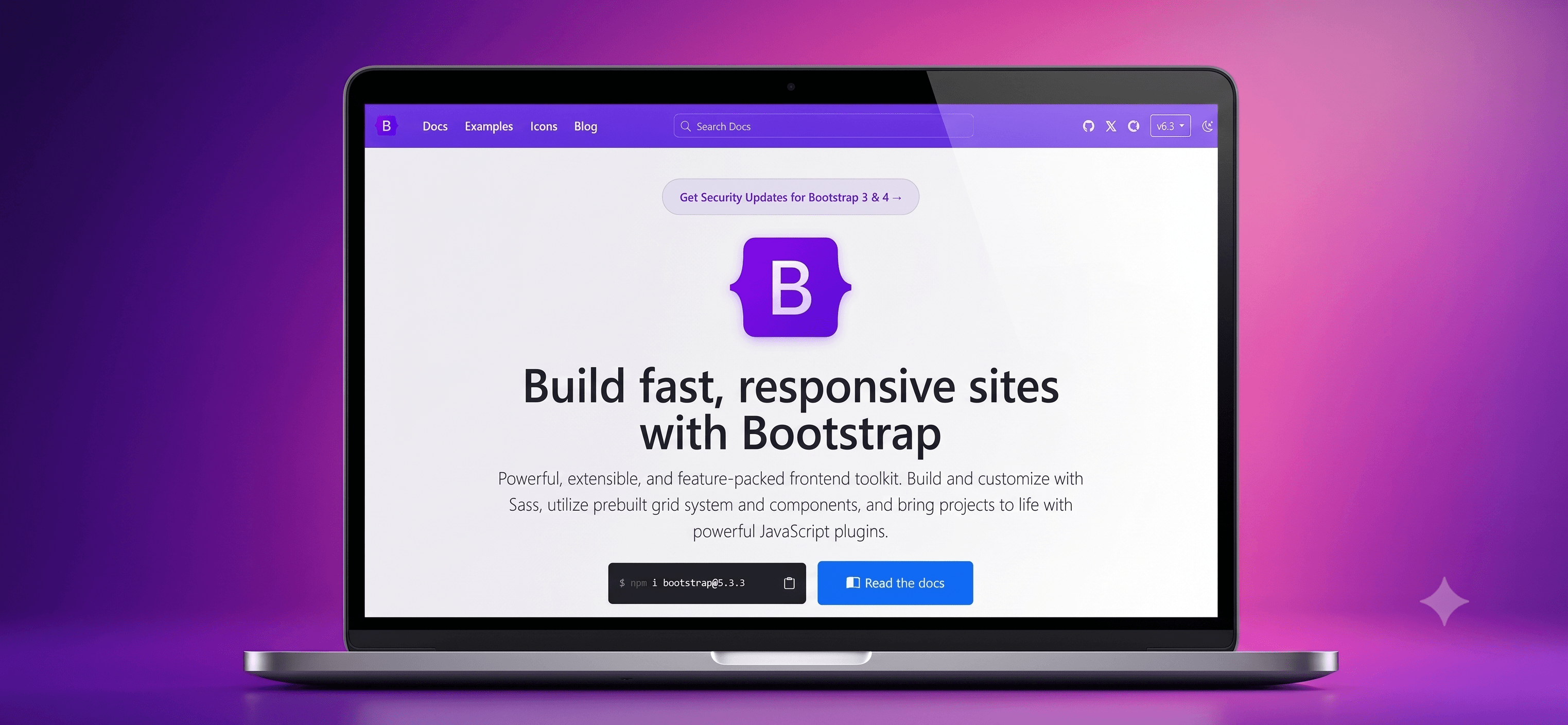
Responsive Bootstrap Landing Page
A modern, responsive landing page built using HTML, CSS, and Bootstrap.
Timeline
1 Week
Role
Frontend Developer
Team
Solo
Status
CompletedTechnology Stack
Key Challenges
- Building a fully responsive layout
- Customizing Bootstrap components
- Maintaining clean and reusable code
Key Learnings
- Responsive design with Bootstrap Grid
- Bootstrap utility classes
- Writing organized HTML and CSS
Overview
This project is a fully responsive landing page developed using HTML, CSS, and Bootstrap 5. It demonstrates modern web design principles while maintaining clean, semantic markup and responsive layouts.
The landing page is designed to provide a professional online presence for businesses, startups, or personal brands. Bootstrap's responsive grid system and utility classes were used to create a mobile-first interface with minimal custom CSS.
Key Features
Core Features
- Responsive Layout: Optimized for desktop, tablet, and mobile devices.
- Bootstrap Components: Uses Navbar, Cards, Buttons, Forms, and Grid System.
- Modern UI Design: Clean typography, spacing, and responsive sections.
- Smooth Navigation: Easy-to-use navigation with section linking.
- Cross-Browser Compatibility: Works consistently across modern browsers.
Tech Stack
Frontend
- HTML5
- CSS3
- Bootstrap 5
Major Challenges
Responsive Design
Creating a layout that looks good across different screen sizes while maintaining consistent spacing and alignment.
Solution
Used Bootstrap's Grid System, responsive containers, utility classes, and breakpoint-specific column layouts to ensure the interface adapts seamlessly to various devices.
Customizing Bootstrap
Bootstrap components often have a default appearance that may not match the desired design.
Solution
Overrode Bootstrap styles with custom CSS while preserving responsiveness and avoiding unnecessary modifications to the framework.
Performance Optimizations
- Optimized image sizes.
- Minimized custom CSS.
- Reused Bootstrap utility classes instead of writing extra CSS.
- Used semantic HTML for improved rendering.
- Kept the project lightweight by avoiding unnecessary libraries.
Future Improvements
- Add dark mode support.
- Improve animations using CSS.
- Add contact form validation.
- Integrate with a backend for form submissions.
- Enhance accessibility following WCAG guidelines.
What I Learned
- Building responsive layouts using Bootstrap's Grid System.
- Customizing Bootstrap components with CSS.
- Writing clean and semantic HTML.
- Creating reusable UI sections.
- Structuring static frontend projects for maintainability.
- Applying mobile-first design principles.