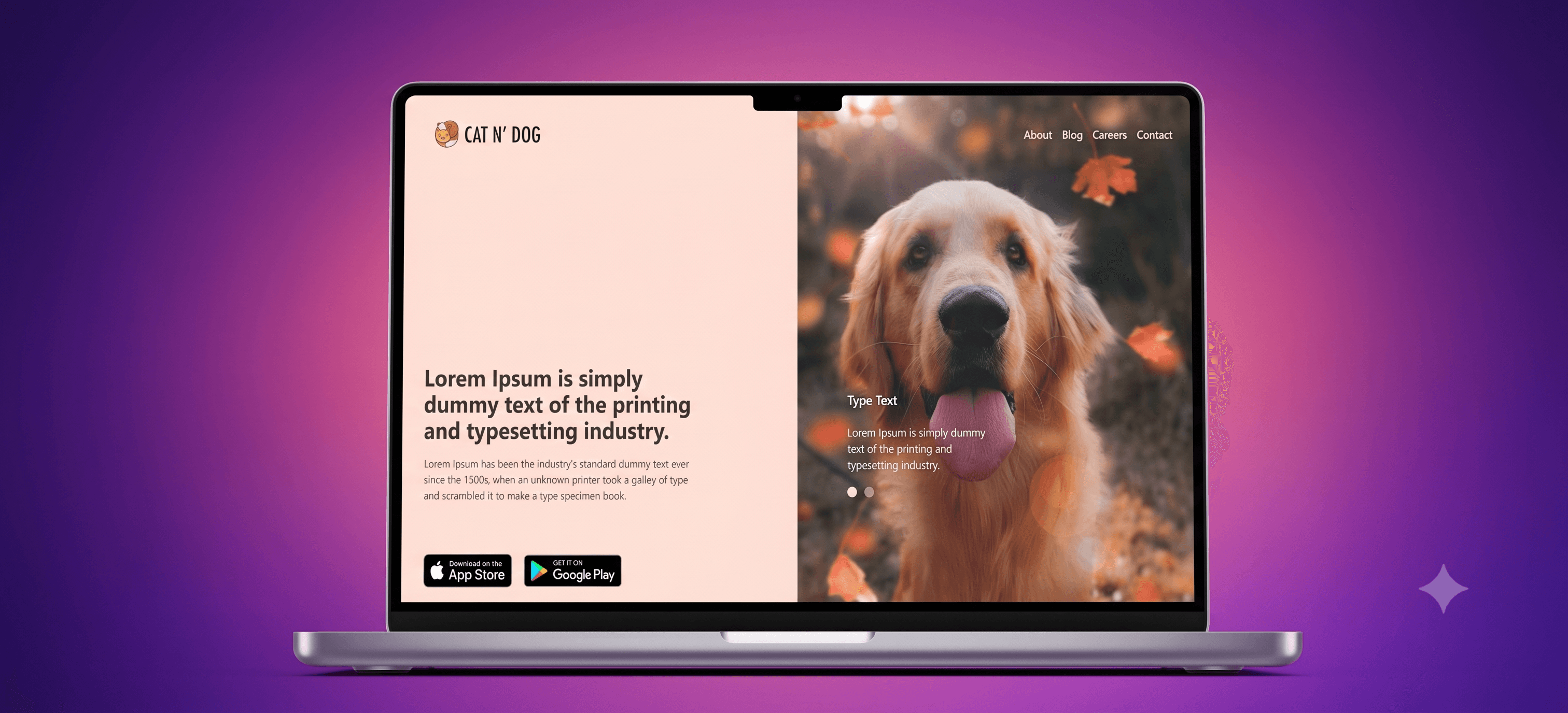
Cats & Dogs
A responsive React web app for pet lovers featuring a dual-pane split-screen design, custom contact validation, a blog reader, and a jobs board.
Timeline
1 Day
Role
Frontend Developer
Team
Solo
Status
CompletedTechnology Stack
Key Challenges
- Resolving Webpack background-image URLs for static asset bundling
- Eliminating viewport height overflows and fixing layout white space issues
Key Learnings
- Ensuring static assets are imported as ESM modules for reliable bundling
- Leveraging flex-based scroll-boxing to control layout bounds instead of raw window scroll
Overview
Cats & Dogs is a responsive, modern single-page web application built for a pet care brand. It is designed to offer pet owners a premium, cohesive browsing experience.
Why it was built
The project was built to complete a partially developed website, adding interactive forms, page logic, routing, and complete sections (About, Pet Journal, Careers) while preserving the original developer's strict theme design, split-screen layout, and assets.
Who it is for
It serves pet parents seeking advice, open job opportunities in veterinary care or development, and a direct way to contact the team.
Architecture approach
The frontend is built on React with Tailwind CSS for fluid, responsive layouts. Routing is handled on the client side via React Router DOM, structuring pages as individual views wrapped in a global Layout wrapper that defines screen restrictions and global styles.
Key Features
Core Features
- Split-Screen Design: A 50/50 dual-pane presentation that showcases a dynamic or static media hero panel alongside a content canvas.
- Interactive Contact Panel: A validated modal form checking for email conventions and completeness, showing success animations, and auto-dismissing.
- Dynamic Pet Journal: A clean blogging section that allows users to browse articles and read full posts via an inline reader state.
- Interactive Jobs Board: Displays open roles with full requirements and a structured application form with instant feedback.
- Fluid Layout Scaling: Scaled layout structure removing vertical page overflows and adjusting automatically to ultra-wide desktop monitors.
Tech Stack
Frontend
- React
- Tailwind CSS
- React Router DOM
- React Icons
Deployment
- Netlify
- GitHub Actions
Architecture
- Client (React App) runs on the browser.
- Routing is managed client-side using
BrowserRouter. - Layout component serves as the global theme parent defining core viewport limitations (
h-screen,w-full,overflow-hidden). - Images are resolved through ESM compilation imports (
import image from './asset.png') to guarantee production bundler output mapping.
Major Challenges
Webpack Asset Resolving
The original codebase referenced local assets via string literals inside CSS background-image inline properties. In a production build, these paths failed to map, resulting in empty layouts and invisible navbar text.
Solution
Imported all background images at the top of the pages/components as modules (e.g., import secondImage from "../assets/secondImage.png") and applied them dynamically within styled templates.
Viewport Overflow and Layout White Space
The introduction of page content caused layouts to stretch vertically, resulting in window scrollbars, misaligned split-panes, and blank white space on ultra-wide viewports.
Solution
Restructured the layout wrapper to use h-screen w-full overflow-hidden, centering content, and moving overflow scrollboards onto local child containers (overflow-y-auto max-h-[80vh]).
Folder Structure
src/
├── assets/      # Image and badge assets
├── components/  # Navbar, Slider, ContactModal components
├── layout/      # Layout wrapper template
├── pages/       # About, Blog, Careers, HomePage views
├── index.css    # Tailwind directives and html/body fallbacks
└── App.jsx      # Route configurations
Future Improvements
- Add a headless CMS integration for dynamic blog post management.
- Introduce dark mode support matching the same peach/charcoal theme.
- Add an backend API server to receive and store contact form queries.
What I Learned
- Learned the importance of importing static assets as modules when building React apps.
- Improved skills in container-based scrolling techniques using TailwindCSS utility classes.
- Better understanding of managing full-viewport applications where standard browser scroll bars are disabled.